When a Card Becomes a Story: A Repeat Client & the Art of Pushing an Idea
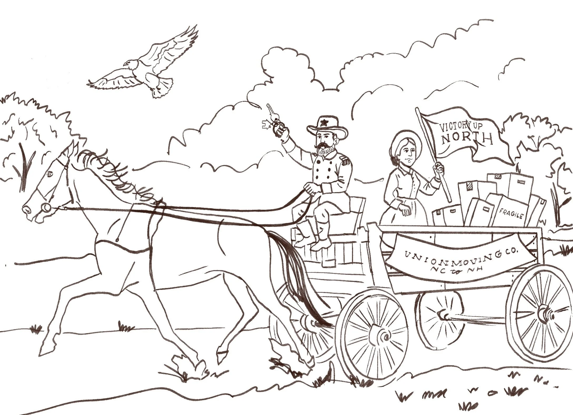
Early Sketch for North vs. South Moving Announcement
One of my favorite kinds of projects is when a client comes to me with trust, not just in my hand, but in my thinking.
There’s a different energy when someone invites you into something personal, not just to decorate it, but to help shape how it’s told. A move, a milestone, a year in review… these aren’t just updates. They’re narratives. And when a client sees illustration as a way to hold meaning, humor, and identity all at once, that’s where I feel most at home.
Meet the Websters! I’ve designed several cards for the family, and each one has had its own personality. Even in year's past, she had other illustrators create smart, layered, a little witty, and always meaningful cards. My client has a sharp sense of humor, a strong point of view, and a real appreciation for illustration as storytelling. I was thumbing through all the previous cards sent over in reference and was just floored that I would get the chance to add my illustrations to this mix. From the beginning, our conversations felt easy. Collaborative. Energizing.
This most recent project started with a simple but bold premise:
“We’re moving. I want to really push this illustration. Let’s play with North vs. South.”
I loved the ambition of that immediately. It wasn’t just an announcement, it was commentary. It had tension, humor, identity baked into it.
My first internal question became: how do we explore that contrast without it feeling divisive or heavy-handed?
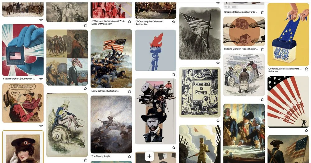
Pinterest Board for the Research Phase
Stage 1: Research & Reference
I started where I often do, with history.
For this particular project, old political cartoons. Civil War era imagery. Vintage Americana postcards.
But I didn’t want “at war.” I wanted tension without hostility. Commentary without cruelty. Humor with heart.
That’s when the concept shifted into something more nostalgic, a vintage postcard feel. A wink instead of a weapon.
Originally, we played with period clothing, leaning fully into the 1800s. But through conversation and sketch revisions, we pulled it forward into something modern. That’s part of refining an idea: pushing it far enough to see if it works, then pulling it back to where it sings.
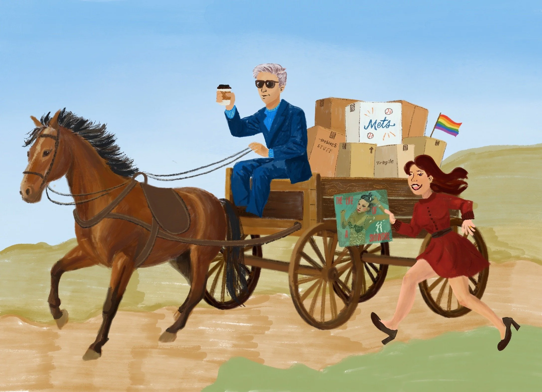
Revised Sketch with Color Added
Stage 2: Refining the Symbolism
What I love about working with her is that every single detail has a reason.
This piece evolved into what I think of as a modern-day Renaissance painting, layered with symbols.
“A Promised Land” by Barack Obama peeking out of a moving box — belief systems and intellectual leanings.
The PRIDE flag draping from the back — a way to say “You belong here.”
The city skyline in the background — what to look forward to.
The horse and wagon — a nod to the past they’re leaving behind.
Each labeled box — fragments of a life packed up and transported from the Mets Hat to the T Swift Album.
Nothing is accidental.
Every time we refined it, we asked: Does this add meaning? Is it too subtle? Do we need more stubble on the beard?
That collaborative dance, pushing certain ideas forward and pulling others back, is one of my favorite parts of custom illustration.
Finishing touches are all in the details.
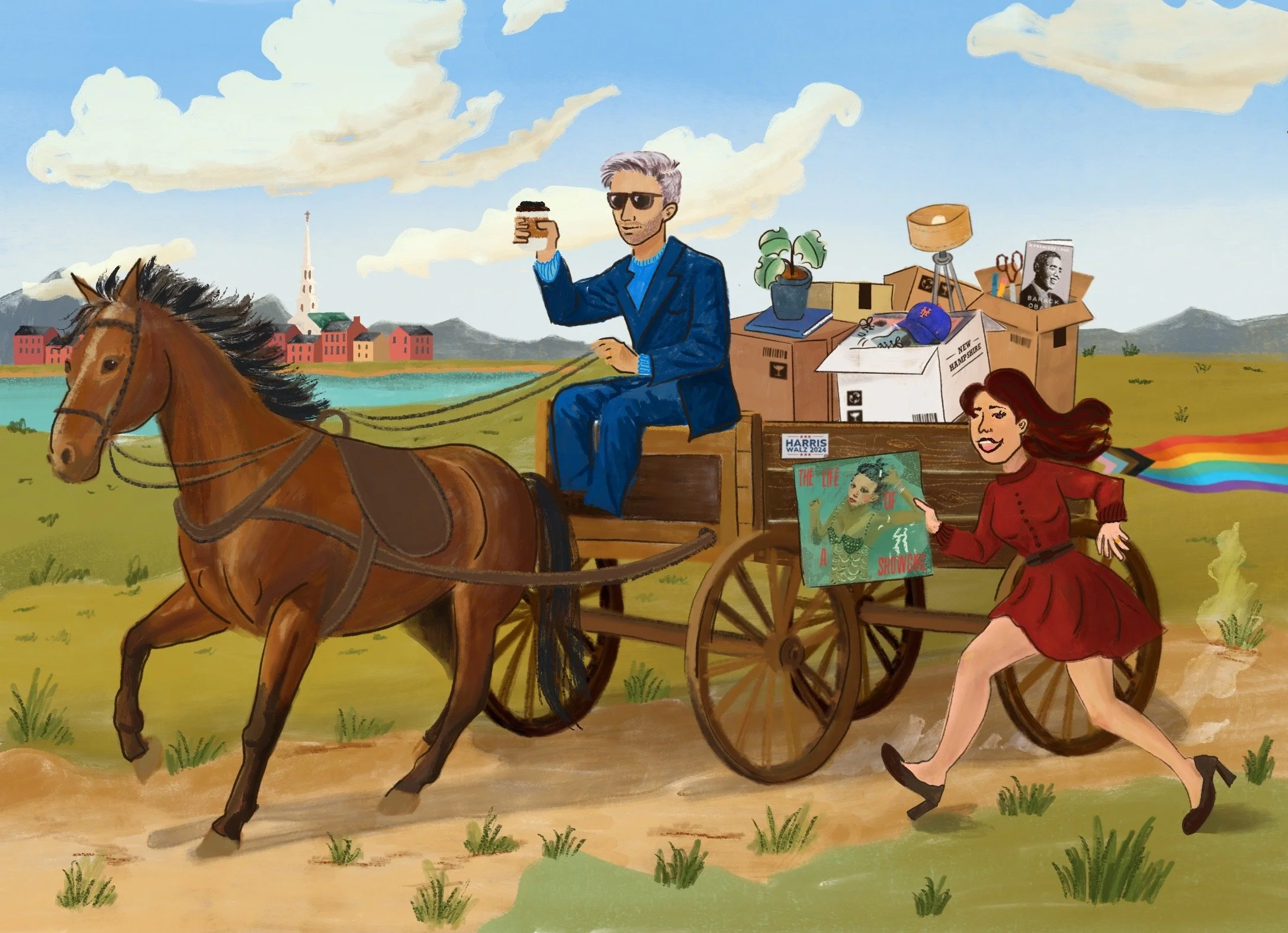
Stage 3: The Final Illustration
By the final version, it felt cohesive.
Modern figures. Vintage composition. Comedic tone. Symbolic density.
It’s funny. It’s pointed. It’s affectionate. It tells their story without saying it outright.
And that’s the magic of illustration—you can say a lot without explaining everything.